Wednesday, January 23, 2013

Green Goddess, Absinthe Boudoir journal

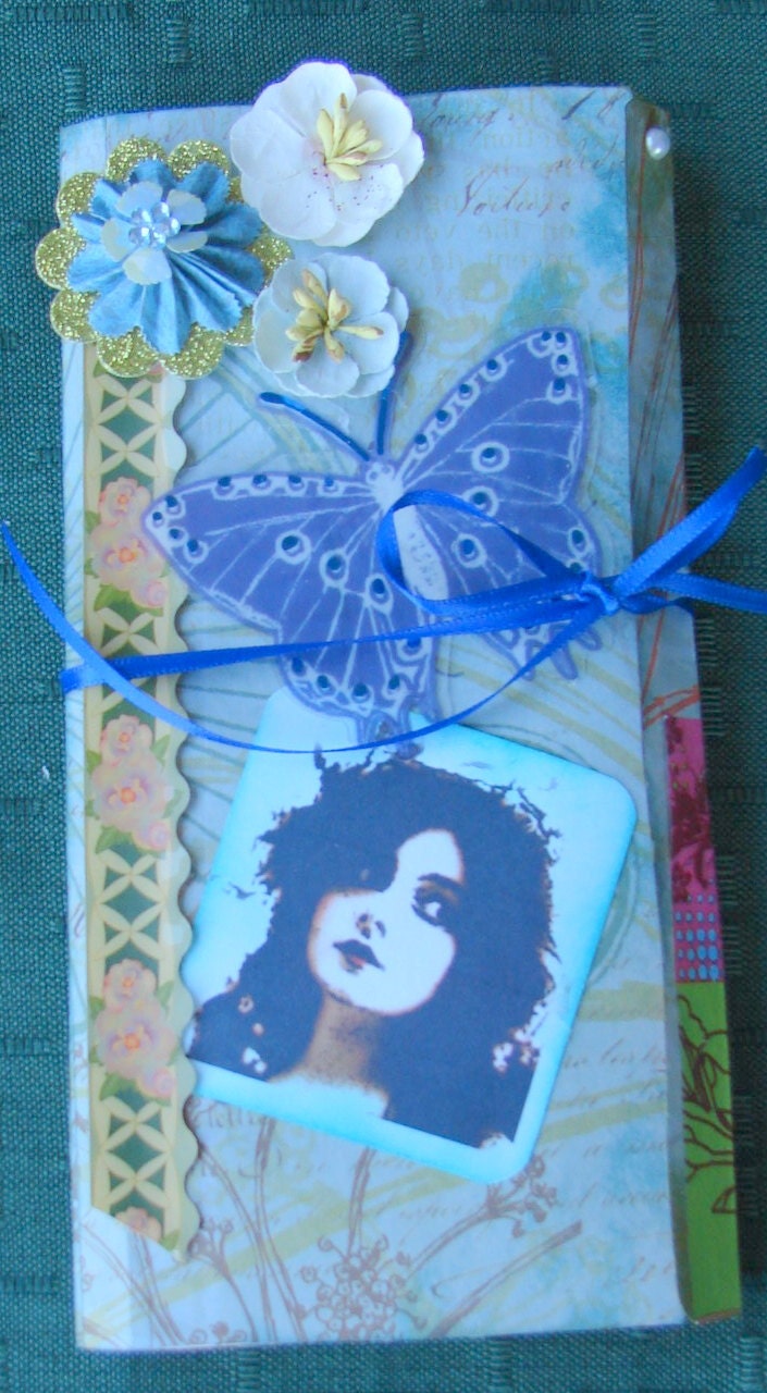
How we do we capture the essence of the Green Goddess? ,As you can see, in this Vintage Absinthe Boudoir journal, I'm trying to capture her in a Victorian terrarium or bell jar.
In this journal, I incorporated papers, materials, ephemera, flowers pigment inks and techniques from Graphic 45, 7 Gypsies, Tim Holtz, Prima, K&Company, and Recollections.

The cover and back of this mini journal and album are Engraved Garden from K&Company.  Accented with an altered vintage image from a painting by Sir, Edward Burne Jones.  I though if anyone could represent the dreams of a Victorian, capturing the Green Goddess this might be the image.
I'm a huge fan of Burn-Jones because of his choice of models and how delicately he draws or paints the human form. 
In keeping with the turn of the century in England, and it's fascination with botany due to the many exciting new botanical discoveries, The Green Goddess as a lunar moth might be Botanist, who imbibed absinthe, might use of capturing such an alluring and allusive specimen. 

And now to the impact of absinthe on our botanist - inside there are vintage labels, bottles and art from the heyday of the Parisian art scene for where else would a cultured person from England go to find such a rare thing than the cafe's in Montmarte, where Picasso, Modigliani and so many other artists were viewing the nude in a whole new way.
  
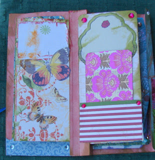
The First page has a graphic 45 image in the corner on a piece of open stock paper and a pocket made with 7 Gypsies paper, embellished with a bottle of vintage Pernod, and in the pocket a painting by Picasso during his blue period, titled "The Absinthe Drinker." painted 1903.  Another tag is also in the pocket which is embossed with a Sizzix die and accented with Ranger Ink and Perfect Pearls.  
So as an amateur botanist, and after finding the gorgeous K&Company Engraved Garden paper pad, I decided to create this vintage Absinthe mini journal with a blend of Victorian, Art Nouveau, and Fin de siècle, influences from the Parisian scene during the turn of the 18th to 19th centuries.

On the second and third pages, I used a piece of one of Brenda Waltons 4X6 paper pads which resemeb a botanists's notebook. 
 On the third page is a another scrap of open stock paper with a pocket made of colored cardstock and a painting by Van Gogh of an absinthe-filled glass and the bottle of water to create the louche. Tcked inside the pocket is a cubist piece by Picasso's, "A Table in a Cafe (Pernod Bottle)" 1912. 

This chock-full journal has a place for everything related to your fascination with absinthe, from a place to schedule tastings, record favorite brands, list your favorite bistros, cafes and pubs which offer Absinthe brands from around the world and right at home, to your favorite absinthe art.

On the fifth page is a Smash journaling tag which states, "Yes" and a pocket showing an advertising painting of The Green fairy on a table in a meadow waiting for the absinthe drinkers.  A cardstock tag stamped with a Graphic 45 stamp is of a dancer in a petaled skirt who could be yet another version of The Green Fairy. 
On the  six page is another journaling spot accented with black flowers and a metallic copper cardstock pocket embellished with a vintage absinthe label. Inside is an embossed copper cardstock art nouvea photomat, accented with Perfect Pearls. And a realism figure painting of a man who looks like Baudelaire titled, "Absinthe Drinker" by Edwourd Manet,1867.
 
This is a compact, ribbon-tied mini journal and photo album where you can record dreams, jot down memories, keep lists, contacts and quotes, save notes on tastings and write your experiences while visiting with The Green Fairy. There are plenty of pockets and envelopes where you can tuck away small trinkets or love letters, lots of tags and photo mats for photos.

The Seventh page is off open stock paper and an absinthe label is added at the top.  In the pocket from K&Company's Once Upon a Time paper stack depicts a dreamy landscape.  Inside the seventh and eight pages is a tag pocket envelop which opens up.  On the cover flap and back page flap are papers from the Engraved Garden paper stack. 
The inside is a large photo mat or two smaller photomats made with a combo of  papers from the Julieanna paper stack and the Once3 Upon a Time paperstack, both by K&Company.

The ninth page contains a large envelope made from Engraved Garden paper kept together with green sealing wax stamped with a Griffin. Inside is another painting tag  from the 1900's.
Beneath the envelope is another vintage absinthe label. 

And the final page is made with open stock papers. Includes a tag pocket made with Julianne paper on and inside the lower border is the painting, "The Muse" by Albert Maignon, 1895. 


I made this boudoir journal using the instructions offered by Steffogal1 on her expert you tube video for her "super cute and fast journal."
The 7 1/2 by 3/12 boudoir journal is the perfect size to take with you to tastings or keep on a bedside table so as to remember all those brilliant ideas, story lines, plans and fantasies that are part of the absinthe drinker's experience. As with everything mysterious, you know you may forget them if too much times passes by. As with most of my other mini journals, this one is available on My Etsy.


Tuesday, January 1, 2013

Vintage Writer's mini album, journal, portfolio

 As a writer, I always need a notebook to jot down my ideas. plot strategies and sometimes entire paragraph's and every writer likes something really special to put their hopefully future published ideas.
So I chose to make a sort of vintage writer's portfolio which can serve as both journal and photo album. The cover using a brown and ivory paper sports the perfect typewriter magnet up oin the corner and a Graphic 45 typewriter tag is attached as well. To the side is a fussy cut vintage fountain pen and a mini mini book I made. I couldn't find any small books so decided to make one. the title says pages de journal (journal pages) and it has a a cover that looks like leather but is really handmade mulberry paper over a metallic copper card stock used as book board. and inside there are 12 small ivory linen pages. the book opens and can be written in, and closes with a metal wire clasp, as does the portfolio although the metal wire is twisted steel and bronze wire.
I made this journal using the instructions offered by Steffogal1 on her expert you tube video for her "super cute and fast journal. I used papers, materials, ephemera, pigment inks and techniques from Graphic 45, 7 Gypsies, Tim Holtz, Prima, K&Company, and Recollections.
Inside the 12 pages of this 7 by 3 inch portfolio, you'll find to do lists, many pockets, envelopes and a library card holder, and tucked inside are lots of photomats and tags to use for notes, even a handmade bookmarker.
On the first inside page, I added a smash to do list over a brown cardstock background. A lower border of metallic copper card stock which I embossed with my Tim Holtz cogs and gears folder and then cut with the Tim Holtz pennant edge die. Inside the border I tucked a tag I made with vintage vellum newspaper with news and advertising for London events.  Every writer, needs to keep up with the news!  How many novels are written just at the inspiration of some headline or even tiny footnote?
On the third page, I attached an enveloiped and tag I made from K&Company julianne paper stack.  the handwritten paper was perfect.  I then added a seal of a griffin with some deep red sealing wax. and a jaunty top hat in the corner shows our writer is one his way to hunt for inspiration.

The third page has a silver metallic folder with a ocket watch as a reminder that time is of the essence as Arthur Conan Doyle would have Holmes say, and tucked in the pocket is a bookmarker I made with another vintage s style Tim Holtz embossing folder.
The fourth page has another journlaing spot with a typewriter, reminding nay to be author that they must write, writer, write! A book page by Grapohic 45 tucked into a lower border emphasizes the sentiment.
The fifth page boasts a number of Graphic 45 cards and tags from both the Communique as well as the Botanicabella collections.  An elaborate Victorian  advertising for tthe best fountain pens is tucked into a corner pocket and an illuminated book page is tucked further back.
On the sixth page, I used a tag from a tag pad from K&Company's Halloween tag pad, covered the words, "witches brew" with a pen nib illustration and added a pocket at the bottom which holds the title page of a thesaurus, as important to a writer as Watson was to Holmes! A Smash sticky note with a pencil, is another reminder.
   On the seventh page, a border holds a tag I made, and a metallic copper photomat and behind is a larger metllic silver photomat - because each author should have photos of their characters if he chooses to base them on real people - which I must confess I do, or at least an amalgamation of real people. which IAs inspiration there are Victorian advertising cards, a vintage newspaper list of news and events, scraps of handwritten letters, old advertising and document cards. 
Now the 8th page is tricky, for here you'll find a fold out envelope pocket holding a photomat with a smash lightbulb sticky note on it as well as lavishly leather covered book illustration.  And below is a secret pocket made from a tag designed by Debbe Anne Parent owner of Vintage Garden Ephemera. When you turn the page you discover the envelop folds out bearing an true vintage label (not a reproduction) advertising spiriteaux from France, because as many writers know liquid inspiration is one of the cures for white page fever.
And then as you turn the page you discover the back of the eyeglass tag is a pocket accented with and embossed border and an arrow reminder to look to the next page. And tucked inside the pocket is a black photomat.  
The final page sports a library holder marked with an"Urgent" sicker, since as we all know it's time to finally submit that manuscript to a publisher b y the agreed upon and all important deadline!  Before computers, emails and the internet, the tedious process must be undertaken by hand, printing, packaging and sealing a writer's child, his most important document up until that moment in his life which he must then mail, with insurance and document information because heaven forbid it never reaches the editor's transom.  I have to say, the old methods of submitting a book to some publisher in New York or London was such a nerve wracking ritual and I do believe its important for every writer to go through such a character-building initiation - because when they receive that acceptance letter - the joy is so much the more intense, thanks to all the pain and waiting suffered beforehand. 


Monday, December 31, 2012

Dreamer boudoir mini album and journal


Dreamer Boudoir mini album and journal
This is the perfect bedside companion - a compact, ribbon-tied mini journal and photo album combined, where you can record dreams, jot down memories, keep lists and quotes, save notes and write drafts of letters. There are plenty of pockets and envelopes where you can tuck away small trinkets or love letters, lots of tags and photo mats for photos
I made this journal using the instructions offered by Steffogal1 on her expert you tube video for her "super cute and fast journal." And
I find this 7 1/2 by 3/12 boudoir journal to be the perfect size to keep on a bedside table so as to remember all those brilliant ideas, story lines, plans and fantasy that arise during that evening or early morning twilight sleep. The style of this "Dreamer" boudoir journal is a mixture of Victorian, Art Nouveau, shabby chic, bohemian and steampunk all wrapped together with ribbon. I used papers, materials, ephemera, flowers pigment inks and techniques from Graphic 45, 7 Gypsies, Tim Holtz, Prima, K&Company, and Recollections. Like the Victorians, I'm a great believer in reusing everything from advertising labels and items to scraps and tatterings left over from other projects or stuffed away in my stash.
The first page features a vintage photograph and a vellum butterfly by K&company, accented by a rosy border and some Prima and K&Company flowers. The second page shows some mulberry paper in a medieval design as the background with a Michael's dollar bin tag tucked into a border made with a Tim Holtz die. The third page features a journaling spot over some open stock French blue paper.


The third page is with a paper from the K&Company Mariposa paper stack  and includes a journaling spot and a place for photos. On the foruth page, I added a journaling tag from K&Company's 2012 Halloween collection and made a red striped pocket and poppy covered tag with paper from the K&Company Jullianne  paperstack. 


The fifth page uses more paper from the Julianne stack and a tag I made with more of the French blue open stock paper from A.C. Moore tucked into a border.  The coiled paper star is from my stash of years ago. On the sixth page, I made a medallion of the French writing paper and overlaid on a open stock Recollections paper.


This is one of my favorite pages with lots of journaling spots, page seven was cut from a get well card someone sent me.  It was too beautiful with it's deep sky blue not to use! And I added another K&Company journaling spot and then made a second one on the tenth page.  In between is a centerfold envelope with two pockets and the inset saying "Dream" with the beautiful bird is from open stock paper.


The third page shows an envelope and tag form Michael's dollar bins over some beautiful open stock paper and I love using advertising in my projects, just as the Victorians did so I used a Twinings teabag in a beautiful purple as a tag holder.

Family mini album portfolio

My daughter as a mother of two girls, is very involved with her family.  So what better theme for her boudoir journal than the joy and love a family bring to the world.  My eldest granddaughter, Kendall, constantly tells her mother she loves her - through notes on a wipe board on the fridge, through texts, and of course hugs and kisses. She also leaves post a notes here and there and creates a magnet heart out of her younger, one year-old sister, Deven's ABC magnetic blocks on the fridge. So there was no debating a theme when it came to my design of my daughter, Beth's boudoir journal. 
The only challenge was a difference in our styles.  I'm all shabby chic and Victorian business with my head in the past or steampunk's future past, and Beth is a minimalist, contemporary woman who prefers neutral colors over my mauves, browns, cobalts and teals.
I have to say this was simply mini journal I ever made.  I can't count the times, I had to snatch my hand away and return a wonderful item to my stash.  Her life is very busy since she works at our local hospital shortly after adults with brain or spinal chord injuries have come out of ICU. That;s is one active world - so when she comes home, while she prefers peace and quiet, she has the home of a very active family. As a single parent she doesn't have much time to herself so I was hoping this simply boudoir journal was small enough that she wouldn't feel too overwhelmed  to use.

I chose a green botanical graph paper paper from a  K&Company's small designer paperstack by Brenda Walton. Then I accented the cover with a green polka dot edge border cut with a Tim Holtz die and tinted the edges green. to keep to her a simple theme, I added a :Family is life's Blessing" embellishment and simply the letter "B" for my daughters first initial hidden in the foliage.
The second page has a pocket made from a seven gypsies paper over a K&Company paper from a stack I've had about five years - I can't remember the name.  I found a tiny scrap that says "I" along with the hart symbol and added it to a top edges border and beneath it added a word sentiment, "scribble daily and have random thoughts." The tag inserted in the pocket is made with metallic copper card stock. The 3rd page is more of the copper cardstock but this time, I embossed it with a Sizzix swirl die and tinted it with purple Perfect Pearls.  On top is a Smash memo list.  I love the little light bulb!   
On many of the pages, I designed all the word sentiments to mean something when read in order such as "Discover, Quick! Quick! Write that good idea down. Happiness.
A pocket and tag I made with paper form the Julianne paper stack takes over much of this page, along with a rondelle which reads "The best thing to hold onto in this life is each other.  The fourth page starts off with some open stock Recollections paper and another Smash list to which I added the recommended "Remember This"  And beneath that I added a quote by Mother Teresa,  I cut from a bookmark,"Small Things doe with great love bring joy and peace."
The fourth page layout I did in greens and browns, since my daughter loves neutrals.  The focus and fun on these pages are tags made by Debbie Anne Parent  over at Ephemera's Vintage Garden.  there are tow different kinds the dramatic mandala flowers and the beautiful dictionary birds. I made a simple pocket on pg 4 and used a stylized belly band on page five made with a Tim Holtz die cut.
The fifth page has another belly band I made with two different card stocks and word sentiments "Together" and "Good Times" and page six Has another Smash to do list and at the bottom I added the word sentiment "Love" which I cut from a 2011 Christmas card.
The final page has a key on brown background and a pocket made from a Julianne paper, along with another Ephemera's Vintage Garden garden ephemera tag and a copper tag and the final page is made with the a family word paper from open stock at A.C. Moore and the pocket is made with some handmade mulberry paper, a border, and the two words "Cherish" Laughter" finalize my thoughts on how our family strives to be.

Saturday, December 29, 2012

Architectural Art

I'm fortunate to live in an area of the south which is vibrant with the arts.  It wasn't always so, over 30 years ago when I moved here from Massachussettes, but it has grown so more over the years.  During the hippie days many of the artys and artisans fled to th emountains where inspiration lay all around them and land was inexpensive. But now the arts have also moved into downtown and even better for me, the Far West End or the Pebdletson Street area, which is like the Montmarte area of Paris. Because of the 65 galleries in Greenville and 100's of art studios - there are plenty of places to find inspiration and sometimes even the oddest supplies.
As much as I love paperarts, there come the times when I need the smell of linseed oil and the weight of heavy metal in my hands- so I leave my scrapbooking area and head into my studio.  I've been painting for ten years and as I've explored lots of techniques, I've discovered my most rewarding work is mixed media - especially oils and metal.  Copper is my favorite metal to work with because of its versatility in colors from copper, to various shades of verdigris depending on the decay to a burnt bronze color when heated.
I went through a period when I lived in my art studio at the Village Gallery in the Pendleton Arts District, when making assemblages was challenging and fun - but I've found it limited to whatever found objects I had on hand - with oil and metal, I can tell the story through the painting and it's theme, then add the metal as accents, exaggeration or even as an exclamation point.  I love architecture but like with everything else I paint, it becomes transformed during my personal perspective on the world - part of it due to my bad sight since 9 years old, the other due to the dreamy aspects I tend to add to every scene in my head - and as often as I can in real life, as long as I'm not driving - and then there's the emotional angle - I am a highly emotional person so everything I do is driven by whatever emotions are driving me at the time. A very fine painter,         put a name to the style - "Emotional Expressionism and that works for me.
I'm working on a series of architectural paintings, inspired by the work British born, Wendy Farrow, whose paintings make me want to be walking through the buildings or standing outside - she also does figurative work, landscapes, abstracts fine arts photography. Her travels, time living in Canada and Paris offer lots of inspiration for her architectural works.
These two paintings my series (I have a third in the works of London Bridge) were a lot of fun to do. The first one is called decision and was inspired by the movie "Stay", probably my absolutely favorite movie of all time. I loved the paintings form the movie but also the film maker's play on the Hudson Bridge, which is so beautiful and seductive, that it becomes a main character in the film, and is the love/interest and antagonist for the lead character an artist,  brilliantly played by Ryan Gosling.   I chose some of the same colors and tonality used in the film, and kept the New York skyline bathed in mist and drizzle, as its shown in one profoundly potent scene.  Then came the fun with the metal - I simply used graphite (a form of metal - lead dust) for the suspension wires of the bridge and then incorporated a drawing I did of Henri Lethem encased in a hammered metal frame displayed on a found piece of brass (I pick things up in parking lots and from the side of the road all the time).
For the city skyline, an artist since 911 must deal with the whole emotional miasma of the empty spots were the twin towers were.  I chose to focus on the Chrysler building by adding a neat folded metal piece,  but I couldn't leave a blank area in the skyline so I added two copper obelesiks as a sort of reminder to myself mainly.  My skyline is not realistic at all with the line up of skjscrapers in New York - I wasn't going for realism here at all since "Stay" is often set in a dream like or otherworldly setting in the minds of both Henri and his psychaitrist, Dr. Sam Foster played by  Ewan McGregor
The second painting is part of my series of drawings and paintings which I'm creating to help flesh out the plot of my steampunk novel in progress, Orchidelirium.  The building is based on a ruined estate in wither Britain, Germany or France from a vintage photograph I found in a shop on Etsy.  The seller sold a number of photos which had not title or photographer credit.  I never knew if they were the sellers own cast offs or if he owned a photo lab and these were developed but never picked up at his store. The photos ranged from the 1950's and onwards and most of them were in black and white and all looked to be taken by professional photographers, I received everything from nudes to architecture, urban to countryside shots - although the countryside shots depicted a photographer taking photos of the country!  Not wanting to limit the photo by adding it to a collage, I decided to paint it instead.  It morphed a bit in the process which suits my idea fine for the mansion of Arisfont Flourent, a main character.
The house is set in England not far from London and is in near ruin.  I incorporated two lovely pieces of metal  - the one near the top of the building is a cast off from my friend Ryan Calloway's blacksmith Shop, Creative Iron works. 

  At one of his art shows, he had boxes of cast offs outside with a sign on them "Free"  so I carted off one I could actually carry.  This is forged and cut iron and it's heavy! If you have a chance you must visit this blacksmith shop - it's large and amazing and Ryan, who was a blacksmith and did restoration work in New Orleans is a master blacksmith.
Oh yes, back to "Waiting" The bottom piece is also heavy and a find with a story - up in the Blue Ridge Mountains you'll find one of the sparkling treasure hunting shops in a town called Saluda, NC. It's just one of three beautiful towns  filled with art and originality, which also includes Tryon,NC and Landrum, SC,  in the string of gems along the way to Asheville,NC
Random Arts is a rarity - a shop with heart and soul and all the goodies you need to feed both!  You will never know what you'll find here - but it will always be surprising and magical.  It's a paradise for altered book artists, journal makers, extreme scrapbooking, assemblage and jewelery artisans.  All the findings are here - many vintage, some rare, all enticing.
This reminds me that its time to make a trip before the snows make the curvy mountain roads scary and see what's in store.  Random Arts also features workshops with nationally known artsists and artisans throughout the year so don't forget to check out their schedule of events.
Okay, so back to "Waiting."  The piece of metal on the bottom of the building was one I found in a grab bag at Random Arts and it serves well as a sort of gate.  It's also very heavy and is obviously a part of some type of machinery - I just don't know from where, what it did or why they made it.  But it's fine with its cryptic markings and adds the paradox of uniformity to a painting that is anything but.  Tucked into the left hand corner is a photo of Ellen Terry at 16 my Julia Margaret Cameron, my absolute favorite photographer of all time.  I was fortunate enough to see some of her original works at one time in New Orleans and promptly purchased the most expensive book I've ever owned there - but boy, it was worth it.  I encased Ellen, who represents Cecila, the protagonist of Orchidelirium.On the left side I added three "windows" using Tim Holtz fragments through which Cecila can see parts of London, including London Bridge, which was  a market district during the late 1890's. 


Thursday, December 27, 2012

Inventor, Scientist, Maker Steampunk Portfolio

 Are you or do you know one of those brilliant inventors, electrical engineers, makers or scientists, always writing notes in all the odd places, and promptly forgetting where you put them? Well search no more - this Nathanial Dillon Pocket Size Portfolio portfolio is the perfect place to tuck those notes and schematics, blueprints and materials lists - and not to forget the ever growing project list. Need a pocket to hold small bits of metal or wiring? There's a pocket for that. What about an envelope for those gadgets so small that if lost, you;d need telescopic monocle to find it? There's an envelope for that - and what about those ideas that streamed across like you brain pan like a series of comets as you enjoyed a fast-paced discussion with your peers, but alas drank Absinthe and now how La Fey Verte has made your mind like a sieve! there's contraption for that!
Fear no more, .. stashing those all important items without which no project can proceed is so easy in this 7 1/2 by 3/1 2 Nathanial Dillon Portfolio - the best stationer's invention on the market - part diary, part notebook, part mini photo album for shots of those inventions you need to use for reference.
There's cards for evidence of the results of experiments, cards for keeping reports and many blank cards and tags for jotting down results and scribbling out the theorems. How did you ever mange without this one-of-a-kind, never to be outdone magnificent portfolio
 Give your wife, your lover, your assistant a rest and keep track of all that essential info all in one compact fold-able place. Compact enough to smuggle anywhere - the rebels in the Equinox Uprising can attest to that!
Even if we don't travel for a live demonstration to your town, don't miss out. Not yet available at stationers or mercers, not even at the rumored Mica Above Air Market - the Nathanial Dillon Portfolio is fun and fast to make! You'll be the envy of anyone with an idea! All you have to do is follow  Steffogal1's most excellent you tube tutorial.  
The style of this portfolio is inspired by one of the main characters, inventor, scientist engineer, Nathanial Dillon,  in my work in progress steampunk novel, Orchidelerium. It is both steampunk and Victorian and the template is based on the tutorial for the super cute and fast journal by Steffoga1. I used papers, materials, ephemera, flowers pigment inks and techniques from Graphic 45, 7 Gypsies, Tim Holtz, Prima, K&Company, and Recollections. Like the Victorians, I'm a great believer in reusing everything from advertising labels and roadside metal findings, to scraps and tatterings left over from other projects or stuffed away in my stash.
The cover in browns - is a bit chaotic, as the brilliant synapses of a brain must be emptied and app;lied to paper all at once. As Nathanial Dillon says, "out of Order,of the comes Chaos.

. For the cover I used a background paper from K&Company's Julieanne paper stack, then added lots of bits and pieces from my stash.  I wanted a journal that addressed all types of science - from neuroscience (hence the heavy metal mask on the cover, as well as the timepiece (made with a card stock clock face and real watch housing,.  I loved this Official time sensitive sticker because aren't all projects time sensitive - a good inventor has to develop his ideas before anyone else does!  And the blue tag is a found object from a textile mill site and the vintage stamp had the look of  Austrian inventor, Tesla, scientist or psychiatrist on it.  He reminds me of Sigmund Freud, the father of neuroscience.  I don't remember where I found the illustration - it was in my science file or what it is - can anyone tell me?  But I had fun surrounding it with amps which to me make it look like the mouth of the Hadron collider - I know that's an odd jump but that's how my mind plays. There are a few jaggedy lines - to me representing electricity made from old school layout tape from my days in advertising before computers when we did all our ad work cut and paste.
The electrical lines continue onto the second page, and actually pretty much throughout the book.  The second page has the background of a paper by 7 Gypsies and layered on top is a tag pocket made of  textured embossed metallic copper card stock because as all scientists know copper conducts electricity . The "Evidence" tag is also 7 Gypsies. Beneath the tag are warning labels, a fragile label and a light bulb reminder because our scientist, with so many ideas running through his brain all the time, becomes a bit scattered from time to time so leaves himself reminders.
The third page is my favorite - this is another paper form the Julieanne paper stack and its so perfect with its copper gilt foil accents. The hand is pointing up to who knows where, the electrical current is amping up and the real hammered copper pocket is ready for the schematics of the next invention. A  "zero" piece in silver and green, as well as a found steel object contradict each other, while the inventor tries to control the electricity by funneling through the steel object, the embellishment, still registers "Zero,"  Still more work to do!
The fourth and fifth  pages, I used 7 Gypsies and open stock papers from Michael's or A.C. Moore. On the fourth page I created a large pocket using paper from the Julianne paper stack and tucked in a plain blank photo mat.  Beneath the electrical wires is another warning label which states, "ATTENTION -  New batteries may require two charge/discharge cycles before reaching full capacity.  Prior to using the battery, it is recommended to carry out two charge/discharge cycles."
 You might be wondering where I found these labels - I found them years ago at the most marvelous recycling thrift store I ever heard of.  It''s The Scrap Exchange located in Durham, NC and at one time, volunteers would go and comb the land fill for industrial items emptied by the truck load.  they carted them back to their warehouse and set up shop.  In there I found medical items from when they still used glass, x-ray equipment, all types of parts from machinery and rolls of warning labels, as well as thousands of other items, bins, hold-alls, springs of all sizes.  You never know what you'll find and it is the absolute to die for place for any scrapbooker, maker or inventor.  they have a wall full of rolls of industrial and commercial labels!  On top of the page is a Graphic 45 tag which I love of a mad scientist testing his flying machine. And on the next page is plenty of journaling with a Smash journaling list and a school notebook tag tucked into a border.
The fifth page I used some 7 Gypsies scraps using a triangle corner pocket to hold a black photo tag emblazoned with a chemistry bottle. a nuclear green paperclip, holds a pen tip as a reminder and another warning sticker keeps our scientist focused on the dangers at hand. The sixth page is made of metallic copper card stock embossed with steampunk gears using the Tim Holtz embossing folder and my Sizzix. At the top is a title card, and below is a double photomat pocket. It opens up for plenty of room for step by step photos and with the flap pockets are two additional photomat cards.
The 7th page bears the label "unbreakable"  (I love the paradox of fragile and breakable all in the same portfolio) with a mini library card holder containing two cards, one a narrow materials list, and a red photo mat card with cryptic designs and letters. The library card holder is accented with an embossed and title card accented with gold leaf.
 The 8th page is another metal copper card stock embossed with a Tim Holtz embossing folder and displaying columns of numbers (plans for a difference engine?" accented with Ranger Inks and Perfect Pearls.  The page overs a to do list, with a Smash reminder to our scientists to write it all down before he forgets or gets distracted by another concept all together.
The 9th page is chock full of tags.  Two are held in the upper pocket bearing an old map.  The smaller is a Graphic 45 tag - perhaps a reference page ripped from a book, the large tag was tucked there by Nathanial,s lady friend, Cecila.  It is the newspaper listing of all the events, parties and performances scheduled around London.  She's so hoping he'll remember how he promised to take him to at least one event.
Below is a pocket made out of woven steel and inside and embossed tag for photos. 
The tenth and final  page is quite pivotal.  Because our scientist has been working so hard on such volatile projects, he's left a photo of himself in case his lab should come to some unfortunate end - explosion, destruction by the Industrial 5, There's also a tag for him to write his full and final report on his findings, as well as a sealed envelope - a note to Cecilia, a last will and testament,  instructions for stabilizing fissionable materials, disarming an explosive device, the recipe for his latest alchemical concoction, or a theorem of physics?  Who's to know except the finder?  And "ah-ah" the finder shall say, before or perhaps after opening the enve4lope And there they will discover a key embedded on a the steampunk pocket...where time is always running out. . . But to what fits the key? His heart, his chest of ancient banned books, his locked cabinet of wonders, his apothecary shed, his below ground distillery, a the housing of Schrodinger's cat, or a getaway 1920 Ford or craftily hidden airship? Only the finder shall know.
Available on my ETSY shop, Gail Gray Studios. 


.

Wednesday, December 26, 2012

Absinthe boudoir journal and mini photo abum


The mystique of absinthe... how do we describe it? How we do we capture its essence of the Green Goddess? Well you can start with this Absinthe Boudoir journal, a place to schedule tastings, record favorite brands, list your favorite bistros, cafes and pubs which offer absinthe brands from around the world and right at home. This a compact, ribbon-tied mini journal and photo album combined is where you can record dreams, jot down memories, keep lists, contacts and quotes, save notes on tastings and write your experiences while visiting with The Green Fairy. and write drafts of letters. There are plenty of pockets and envelopes where you can tuck away small trinkets or love letters, lots of tags and photo mats for photos
I made this journal using the instructions offered by Steffogal1 on her expert you tube video for her "super cute and fast journal. The 7 1/2 by 3/12 boudoir journal is the perfect size to slip into a handbag or keep on a bedside table so as to remember all those brilliant ideas, storylines, plans and fantasies that are part of the absinthe drinker's experience. As with everything mysterious, you know you may forget them if top much times goes passes. And this is one of the Victorian, Turn of the Century, Art Nouveau, Steampunk journals, I have up for sale on my Etsy page at Gail Gray Studios.
The style of this "Absinthe is a blend of Art Nouveau, Steampunk, Victorian, Fin de siècle, French and a bit shabby chic - after all who has much to spend after imbibing in absinthe. C'est la vie!
Inside, tucked away in pockets and envelopes, a mini notebook and on the backs of tags, you'll find directions to accomplish that ghostly louche, absinthe quotes, advertising labels and illustrations of absinthe art and advertising, a list of famous absinthe drinkers, a place where you can list your favorite absinthe haunts and more. And there's lots of room for you to add your own notes on the experiences and history of the absinthe culture.

In this journal, I incorporated papers, materials, ephemera, flowers pigment inks and techniques from Graphic 45,     7 Gypsies, Tim Holtz, Prima, K&Company, and Perfect Pearls, Ranger, Recollections. Like the Victorians, I'm a great believer in reusing everything from advertising labels and items to scraps and fragments, left over from other projects or stuffed away in my stash.The first and second  pages shows some advertising from the hey-day of the Absinthe rage in Paris and beyond, as well as a pocket topped by a photo of the louche - when water is poured over a cube of brown sugar to cause the green absinthe develop a ghostly white mist floating in the body of the liquor.  Tucked inside the pocket is a vintage spiriteaux tag. On the second page is 1835 painting of La Fey Verte by Albert Maignan's 1835 over a metallic copper embossed and textured background made with a Tim Holtz embossing folder and by Sizzix machine and below is another embossed page depicting a sun in an art nouveau style accented with an absinthe label.
The third and fourth pages include a long vertical slide out pocket which holds a photo mat or a place to jot notes on tastings or brand. As an embellishment I added a Graphic 45 framed Art Deco woman.  The fifth page is made with a brown background emblazoned with keys and inserted in gutter holder is a photo mat and notebook where to list famous absinthe houses and local pubs, bistros and cafes which serve absinthe. A coiled paper flower competes the effect.
The fifth and sixth pages focus on the dreamy effects of absinthe, with ta pocket and a journaling tag, and an enveloped and a journaling tag/photo mat.  The envelope can be sealed for those special private entries. w pockets to record dreams, memories, and encounters before the Green goddess whispers in your ear and all is forgotten. Textured and embossed papers were used as well as a Graphic 45 Steampunk Debutante postal stamp.
The final two pages include a tag from Michael's dollar bins and a Smash note keeping page simply stating "Yes!"  Yes to favorite brands of absinthe!  Yes to absinthe invitations!  Yes to new absinthe friends!  All proclaimed by the vintage painting of a beautiful art nouveau woman hoisting her glass in a toast.